The Diptych

This is one of the photography techniques used by Gibson in his book “Refraction”.

Image result for ralph gibson diptych

I think this type of imagery is very interesting, and it gave me an idea to make a fun and different twist on Gibson’s work. Firstly, i took multiple mugshots of my model, and split them in half, changing which halves go with which. I also changed the spacing between each to create a more quirky look.

IMG_E2059[1].JPGIMG_E2065[1].JPG


IMG_E2061[1]


IMG_E2062[1]


IMG_E2060[1].JPG


IMG_E2063[1].JPG


Ralph Gibson

My main inspiration for my images is Ralph Gibson and his book “Refractions- thoughts on aesthetics and beauty”. Gibson was an assistant to Dorothea Lange, which is how I came across him when researching Lange herself. Gibson has some very interesting ideas about aesthetics, and has given me ideas on what to photograph and how to photograph.

Image result for ralph gibson

Ralph Gibson

In his book, Gibson explains that Lange told him for an image to work, “a photographer must be directed, have a point of departure”. Because of his book, I decided to take images of aesthetic architecture.

One type of aesthetic imagery I would really like to explore is imagery of nothing. Gibson explains he was inspired by Ad Reinhardt, and took a picture of the sky that was “nothing more than a grey rectangle, yet it functioned totally as a photograph”. I have tried to take images of nothing, and make them aesthetically pleasing.

One successful example of this is the famous painting by Robert Rauschenberg, “White Painting (three panel)”

Image result for white painting

This is just a blank canvas painted white, yet it is regarded as an aesthetically pleasing image.

Another example is the fictitious “Rabbit in a Snowstorm” painting in Marvel’s “Daredevil”

Image result for rabbit in a snowstorm

My image of nothing is self titled as Static.IMG_2078[1].JPG

I managed to create this image by taking a photograph of a blank screen, hence the clearly shown individual pixels. I believe images such as these are very interesting, as they question the definition of beauty.


Exploring Dorothea Lange’s style

Dorothea Lange was an American photographer, who was well known for her Great Depression photographs. One way to distinguish Lange’s work is by a black and white image usually depicting working class Americans during the Depression. One reason I am very interested in her work is because all of her images are very intimate. This works well for her pieces, which were created to raise awareness for how the Depression had affected America. Her images convey a lot of raw emotion, and therefore work well with the black and white photographs.

Image result for dorothea lange

Dorothea Lange 1895-1965

One image I regard as beautiful is Dorothea Lange’s “Migrant Mother”

Migrant mum

Migrant Mother Dorothea Lange 1936 

The reason this image is regarded as beautiful is because it is a candid image of human nature. The way that children are all leaning and resting on the mother I believe has a symbolic meaning. Since this was taken during The Great Depression ,it shows that the children are relying on the mother to survive, and the mother is barely making ends meet. I have assumed this from the body language of the mother and the children, as the children are all leaning on the mother exhausted, and the mother’s facial expression shows fatigue and worry. The image is so detailed, and it shows every small blemish on the mothers face, and really expresses her emotions to the camera.

Another image I like by Lange is the image of a woman in a car window. I do not know the name of the image, but I do know it is Lange’s image. The reason I like this image is again because of the candid approach, but also the symbolic meaning of the woman’s view.

Image result for dorothea lange woman in car

The woman is staring off-camera, yet through the reflection in the window we can see what she is looking at – the clouds in the sky. To the woman, these clouds could remind herself of her journey, blowing around America aimlessly in hope of a job of money. Her face is very weathered, which shows age and experience.

IMG_E2068[1]

This is my first image in imitation of Migrant Mother. The over the shoulder shot and the direct look at the camera creates an intimate relationship between the viewer and the model. The reason I chose to use a mirror is because it allows for multiple perspectives in one shot. It also allows the audience to better read the models body language in relation to the facial expression. The model looks angry, and this is also shown by the stiff body language and slightly clenched fist. The only editing that I have done to this image is to add a silver-tone filter, which has been done to firstly imitate Lange, but secondly it creates a more sombre tone.

IMG_E2076[1].JPG

This image I am very pleased with. In the style of Lange, it shows part of the models grim face, and the reflection of the window to show what he is looking at. Most of the editing done here was to really express the buildings in the reflection so that they are clear and easy to see.

The aesthetic of Preston architecture

There are many historical buildings in Preston, some of these buildings designs appeal to me on an aesthetic level.

There are some historical buildings and monuments in Preston that I find aesthetically pleasing for a number of reasons. The first image is of the Bistrot Pierre. I tried to get a shot that included the clock tower in the background, but there was no angle that i could get without any modern industrial imagery blocking the bistrot, such as a lamppost or a car. The reason I find this building aesthetic is the large circular brickwork in the centre of the main building. This circular geometric design is very symmetrical, and to me, aesthetically pleasing. The way that Bistrot Pierre is printed on the smaller section of the building also appeals to me, as it follows the rule of Thirds and helps to balance out the overall look of the building.IMG_E2020[1].JPG

The rule of thirds is shown here by the writing offset to the left, the main geometrical circle in the centre of the image, and the chimney and smaller circle taking up the right side of the image. Additionally, the type of brick used for the building sets it apart from all industrial buildings, as the sandstone shade of brick used looks much better than the brick red of newer buildings. The way that the smaller section of the building sticks out is what makes the building aesthetic in my opinion.

This is my favourite image that I have taken. The reason I like this image is because of how imposing the building and pillar look. This is due to a low angle shot from further away. I have done very minimal digital editing to the image, as I like the natural light of the cloudy sky. Another reason I really like this image is because of the symmetry the building has, as the pillar splits the building into two identical segments. Additionally, since the building is separated by everything in the fore and background, it makes the building seem much more prominent and important. IMG_E2021[1].JPG

The lighting also helps to create a certain atmosphere of the building. All of the lighting is directed straight upwards to the building and pillar. This has the effect of creating small shadows that rise up the building. I think this is effective because this type of lighting adds more dimension and height to the building, making the building almost intimidating to look at.

Church…

An exploration of the Christmas Aesthetic


This is the Christmas aesthetic. The Christmas aesthetic is a mixture of white and red hues to create a festive look. One of the reasons I like this aesthetic is because it is very polar, because there are multiple very different looking aesthetics.

The aesthetic I decided to replicate is the minimalist white Christmas. The reason I like this image is because it has the lights alongside the busy street. I also think it would be relatively easy to replicate, possibly make the image look better than the ones shown here.

The other type of Christmas aesthetic is the very bright and colourful side. This is very different to the aesthetic that I have chosen, and the reason I did not choose to explore this aesthetic is because I believe it to be gaudy and there is too much going on in the image for any single part to be focused on and appreciatedImage result for christmas aesthetic

Here is a list of the other Christmas Aesthetics:

https://www.theodysseyonline.com/my-top-ten-favorite-christmas-aesthetic


One image I took is from the Fishergate shopping centre. The image consists of large white Christmas lights to create a modern snowy look. The reason i believe this fits the Christmas aesthetic well is because of the minimalist approach the designers have taken. Similar to Ingarden’s views on aesthetic images, these lights were already beautiful, but the act of me taking the image and editing it has made this image a separate piece of art from the lights themselves.IMG_E2018[1]

I have digitally edited the image to show more contrast between the background and the lights in the image. This has made the light globes have a much more spacey effect, especially the top right globe, which looks similar to a moon. These bright white lights work well in the Christmas aesthetic as obviously they are the same colour as first snow, but they also have the effect of expense, and draw well from the minimalist aesthetic. White is also associated with purity.

IMG_E2019[1]

I also took this picture of the high street. I made the reflections of the light on the wet street much brighter by altering the saturation and contrast of the image. This makes the image seem much more bleary, and puts a lot more focus onto the lights. I find this aesthetically pleasing as, with the editing the image is almost blurry and has a much more surreal look to it. Most people walking down this road do not see the beauty of the Christmas lights above them. I personally think that without the digital editing to increase the reflection of the lights into a focal point, this image would not be aesthetic. One change that I would have made to the image is to somehow darken the sides of the image, as the bright orange lights emitting from Primark are not really necessary for the image.

“Instagram Takeover”

During one of our first lectures, we were tasked with taking photos to fit the 9 key words we were given.

The first word was beauty. Similar to my other blog on “What is beauty?”, I have taken inspiration from nature and took a picture of flowers in bloom. I added a slight filter to add contrast between the sharp orange and varying yellow hues. My other idea was to take a portrait picture of a person smiling, symbolically showing that emotions such as happiness are beautiful. I think that if the image had a depth of field, it would bring much more focus to the flowers in the foreground and overall improve the image.IMG_1786[1]

Another was mono. Obviously the first idea for an image relating to mono was a black and white filter, however I thought that would be very generic, and so I looked for something already mono. Near “Ships and Giggles” in Preston city centre, is a wall with graffiti “NERO”. I tried to get the graffiti in the frame with the natural light from the top down, to give the graffiti an almost ethereal look. One part I really like about the image is that you can clearly see the lines from the sunlight, which adds a slightly disorienting feel to the image.IMG_1803[1]

Thirdly,  we had to take a picture of something relating to a shadow. At first I was trying to think of how I could convey a shadow metaphorically, but after looking online at images i could replicate myself, i realised I could make a shadow that resembles something else. At first I was thinking of taking a picture of two people, each polar opposites of each other. They would have mirrored each other, yet been different, similar to a person and their shadow. I instead decided to use a nondescript item you wouldn’t expect to create a shadow that represents something other than the normal stereotypes associated with shadows. By making a heart out of shadow, it goes against the normal stereotype of shadows being dark or evil, and shows a positive representation. While my image only shows a card loop, if I had more preparation time I would have replaced the loop with a wedding ring, and placed the ring on a book with symbolic writing on it, for example Romeo and Juliet by Shakespeare. To me, the loop represents unity or marriage, however since i created the image my view is different than that of the audience.IMG_1798[1]

Finally, I was struggling to find an image that related to the word mistake, when I saw a piece of graffiti on a bin. I find this to be symbolic of both, as most people associate graffiti with mistakes, and for it to be on the bin. Bins are associated with mistakes, as people throw away or discard used items. One idea I could have done would be to add a darker filter over the bin, and straighten the camera and crop out some of the backdrop. IMG_1792[1]

To see any of my other images alongside the ones shown here, have a look at my Instagram account – louiscollins240700

Aesthetics

“Aesthetics is a branch of philosophy that explores the nature of art, beauty, and taste, with the creation and appreciation of beauty.” – Wikipedia

I have become interested in aesthetics because it helps to explain what an audience finds visually pleasing, and why. Immanuel Kant believes that humans perceive images, such as a sunset, as aesthetically pleasing due to “Universal and Necessary judgements”. For something to be aesthetic, according to Kant, universally most humans will see it as aesthetic, and just by this large number of people saying something is aesthetic makes it so. For something to be “Necessarily” aesthetic is similar to the “What is beauty?” question, as nature or a perfect habitat is shown as aesthetic, because it represents safety or living.

Roman Ingarden questions “Whether a work of art is a physical object having a specific form or whether it is rather something which is constructed on the basis of a physical object as an entirely new creation brought into activity of the artist”- The British Journal of Aesthetics, 4 page 198-213. What I have inferred from this is that Ingarden is questioning if a physical object is already a piece of art, or if the artist expressing this object makes it into a new, different item that is now regarded as art. When related to photography, the latter is definitely true. Just by taking a photo of an object or a person, turns that item into a piece of art.

Ingarden then continues to state “Even if he(the artist) tries to remain true to the work itself, the aesthetic object actually produced by the observer often differs in many details of articulation from what is permitted or demanded by the work itself”. As shown in my other blog entries this is true. Although my images have been digitally edited, they still would not look the same as if someone were to try take the same picture. Image result for roman ingarden

My work is going to take inspiration from Ingarden’s journal entries, and has given me some clarity on what to aim for when creating an aesthetic image.

In a book about aesthetics and the sociology of art, it states that aesthetics are influenced by “society or by certain of its key members”. This is true regarding the Christmas aesthetic, in which the colour red was introduced by coca-cola as a marketing scheme to link Santa to Coke.

Finally, Goodman states that “Aesthetic merit is such excellence in any symbolic function that, by its particular constellation of attributes, qualifies as aesthetic”. My understanding of this is that if an image or item is of excellence, this image can fit the certain aesthetic that it is trying to achieve.


What is Beauty?

During one of the first Photography lectures, the concept of beauty was questioned. Why do humans perceive some images as beautiful, and others not?   One of the images shown was the painting “The Hay Wain” by John Constable.

John_Constable_The_Hay_Wain

The Hay Wain John Constable 1821

The reason I believe this image is shown to be “beautiful” is because it is a snapshot of nature. Denis Dutton, a Philosopher of art, states in a TED talk “People in very different cultures all over the world tend to like a particular kind of landscape, a landscape that just happens to be similar to the pleistocene savannas where we evolved”. Essentially, we find nature beautiful due to certain aspects of the setting. Looking at “The Hay Wain”, for example, a flowing river is a water source and food source, a forest shelter and resources.

Secondly, since the image is hand-painted, some may understand how difficult and time-consuming it is to paint an image of this calibre. Another image of Constables’ that shows nature and humanity working synonymously is “Salisbury Cathedral from the Meadows”

Skripal Cathedral.jpg  
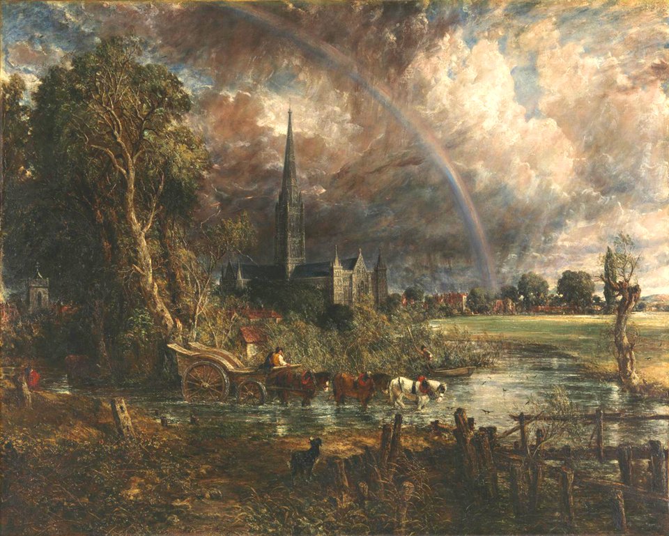
Salisbury Cathedral from the Meadows John Constable 1831

I have taken inspiration from these two images, and have taken two of my own replicating the wide shots showing nature and human settlement, shown below.

IMG_1787[1]

I firstly added a brighter filter to the image, to make the sky seem brighter and to let the church contrast against the foreground. This image shares many similarities with Constables’ image, yet my image is digital and Constables was hand painted. Some key differences are that Constable’s picture has a larger colour palette, and was set at a different time of day than to my image. My image is also a low angle shot, instead of a long shot. This shot is much better at conveying the scale and beauty of a church, as a low angle makes it seem almost as if the church is reaching up towards the sky, or heaven. A long shot shows more the contrast between the nature and the church, which while it is beautiful, I do not believe it is as captivating.